Welcome Screen

Learn about the evolution of the first screen in Xamarin Studio and Visual Studio for Mac.

Welcome Screen

Learn about the evolution of the first screen in Xamarin Studio and Visual Studio for Mac.

Welcome Screen

Learn about the evolution of the first screen in Xamarin Studio and Visual Studio for Mac.

Welcome Screen of Visual Studio for Mac, featuring options to discover new features, learn about .NET Core and Xamarin for mobile development, with a list of recent projects and a section for developer news.

Welcome Screen of Visual Studio for Mac, featuring options to discover new features, learn about .NET Core and Xamarin for mobile development, with a list of recent projects and a section for developer news.

Welcome Screen of Visual Studio for Mac, featuring options to discover new features, learn about .NET Core and Xamarin for mobile development, with a list of recent projects and a section for developer news.

Welcome Screen of Visual Studio for Mac, featuring options to discover new features, learn about .NET Core and Xamarin for mobile development, with a list of recent projects and a section for developer news.

Welcome Screen of Visual Studio for Mac, featuring options to discover new features, learn about .NET Core and Xamarin for mobile development, with a list of recent projects and a section for developer news.

Welcome Screen of Visual Studio for Mac, featuring options to discover new features, learn about .NET Core and Xamarin for mobile development, with a list of recent projects and a section for developer news.

Client:

Xamarin → Microsoft

Client:

Xamarin → Microsoft

Client:

Xamarin → Microsoft

Years:

2013 – 2021

Years:

2013 – 2021

Years:

2013 – 2021

Roles:

User Interface Design, Icon Design, HTML/CSS/JS

Roles:

User Interface Design, Icon Design, HTML/CSS/JS

Roles:

User Interface Design, Icon Design, HTML/CSS/JS

Team:

Visual Studio for Mac

Team:

Visual Studio for Mac

Team:

Visual Studio for Mac

Decoding the Welcome Screen

The Welcome Screen of Xamarin Studio and its successor, Visual Studio for Mac, is where developers’ journeys begin. This page delves into the evolution of thisintegral screen, spotlighting the designer’s role in its transformation and the intersection of design and code that brought it to life.

The Welcome Screen is the IDE gateway, offering quick access to recent solutions, learning resources, and pre-built apps. Its design is crucial as it sets thetone for the user experience.

Xamarin Studio: the genesis

Xamarin Studio was an innovative cross-platform Integrated Development Environment (IDE) designed for building native mobile applications with C# and F#. Itprovided developers with platform-specific SDKs, emulators, built-in UI design layouts, and a sophisticated code editor, making app development faster and moreefficient.

Originating from the engineers behind Mono, Xamarin was acquired by Microsoft, becoming a critical tool for .NET developers aiming to create performance-drivenapps for iOS, Android, and Windows.

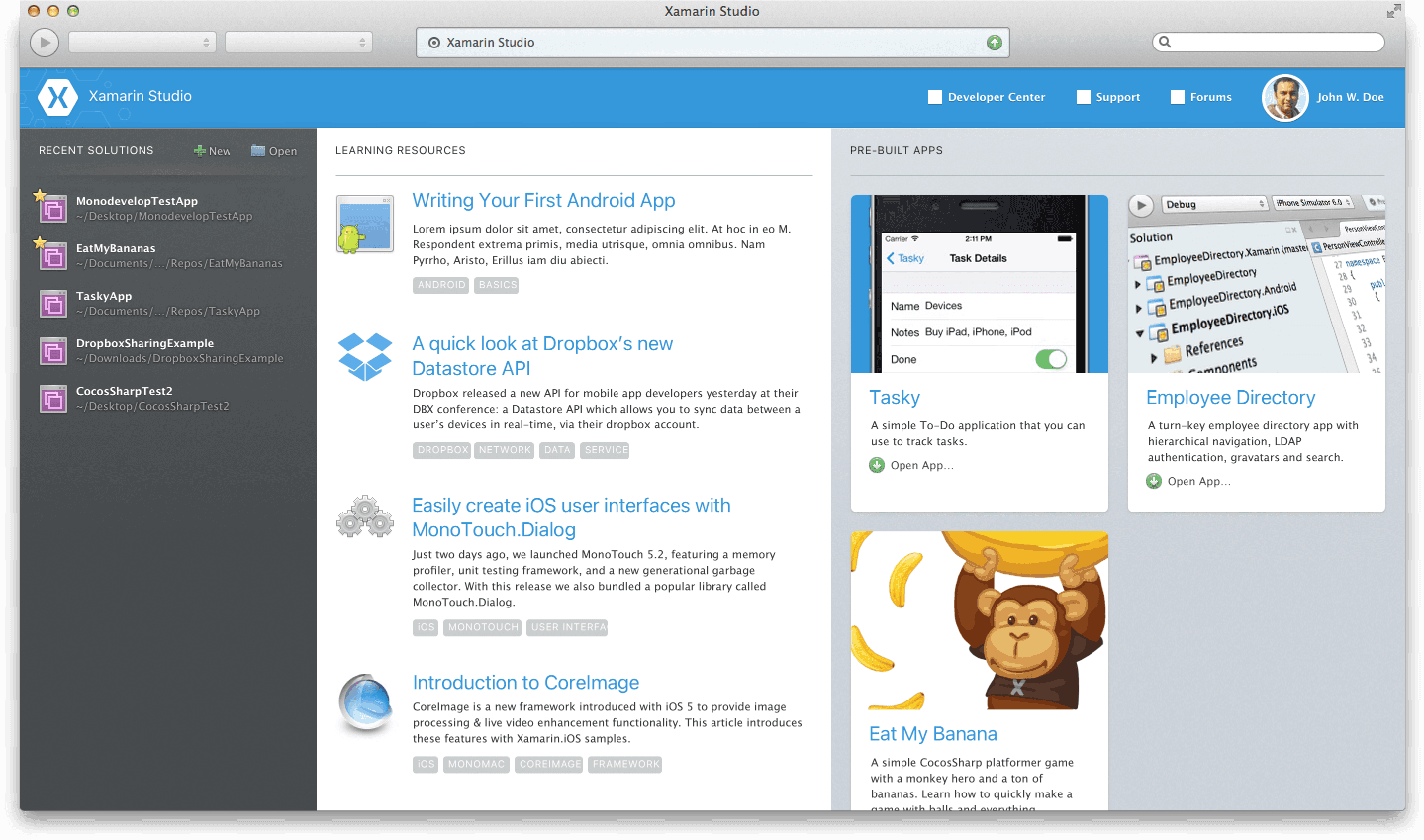
The original Xamarin Studio pre-2013 had a practical but rudimentary design. Welcome Screen with a solutions panel on the left, social feed from Xamarin HQ in the center, and a preview of an example app called Xamagram on the right.

The original Xamarin Studio pre-2013 had a practical but rudimentary design. Welcome Screen with a solutions panel on the left, social feed from Xamarin HQ in the center, and a preview of an example app called Xamagram on the right.

The original Xamarin Studio pre-2013 had a practical but rudimentary design. Welcome Screen with a solutions panel on the left, social feed from Xamarin HQ in the center, and a preview of an example app called Xamagram on the right.

The original Xamarin Studio pre-2013 had a practical but rudimentary design. Welcome Screen with a solutions panel on the left, social feed from Xamarin HQ in the center, and a preview of an example app called Xamagram on the right.

The original Xamarin Studio pre-2013 had a practical but rudimentary design. Welcome Screen with a solutions panel on the left, social feed from Xamarin HQ in the center, and a preview of an example app called Xamagram on the right.

The original Xamarin Studio pre-2013 had a practical but rudimentary design. Welcome Screen with a solutions panel on the left, social feed from Xamarin HQ in the center, and a preview of an example app called Xamagram on the right.

Xamarin Studio 4

Work on Xamarin Studio 4 (released in 2013) marked the beginning of my journey with Xamarin, introducing key enhancements that refined the mobile app development workflow. This version featured a sleeker user interface and sophisticated code editing tools.

Xamarin Studio 4

Work on Xamarin Studio 4 (released in 2013) marked the beginning of my journey with Xamarin, introducing key enhancements that refined the mobile app development workflow. This version featured a sleeker user interface and sophisticated code editing tools.

Xamarin Studio 4

Work on Xamarin Studio 4 (released in 2013) marked the beginning of my journey with Xamarin, introducing key enhancements that refined the mobile app development workflow. This version featured a sleeker user interface and sophisticated code editing tools.

My focus was optimizing developer interactions, improving project integration, and bolstering overall IDE performance – all of which set the stage for the seamless transition to Visual Studio for Mac.

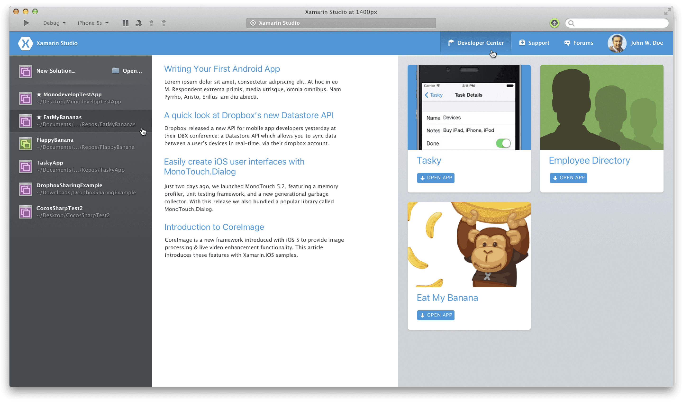
We iterated through many designs for the Welcome Screen until we settled on the one shipped with Xamarin Studio 4.

This Welcome Screen design features the old icon set and is running in the outdated Xamarin Studio 3 chrome. It showcases the old icons that were based on the pre-Mavericks icon aesthetics.

This Welcome Screen design features the old icon set and is running in the outdated Xamarin Studio 3 chrome. It showcases the old icons that were based on the pre-Mavericks icon aesthetics.

This Welcome Screen design features the old icon set and is running in the outdated Xamarin Studio 3 chrome. It showcases the old icons that were based on the pre-Mavericks icon aesthetics.

This Welcome Screen design features the old icon set and is running in the outdated Xamarin Studio 3 chrome. It showcases the old icons that were based on the pre-Mavericks icon aesthetics.

This Welcome Screen design features the old icon set and is running in the outdated Xamarin Studio 3 chrome. It showcases the old icons that were based on the pre-Mavericks icon aesthetics.

This Welcome Screen design features the old icon set and is running in the outdated Xamarin Studio 3 chrome. It showcases the old icons that were based on the pre-Mavericks icon aesthetics.

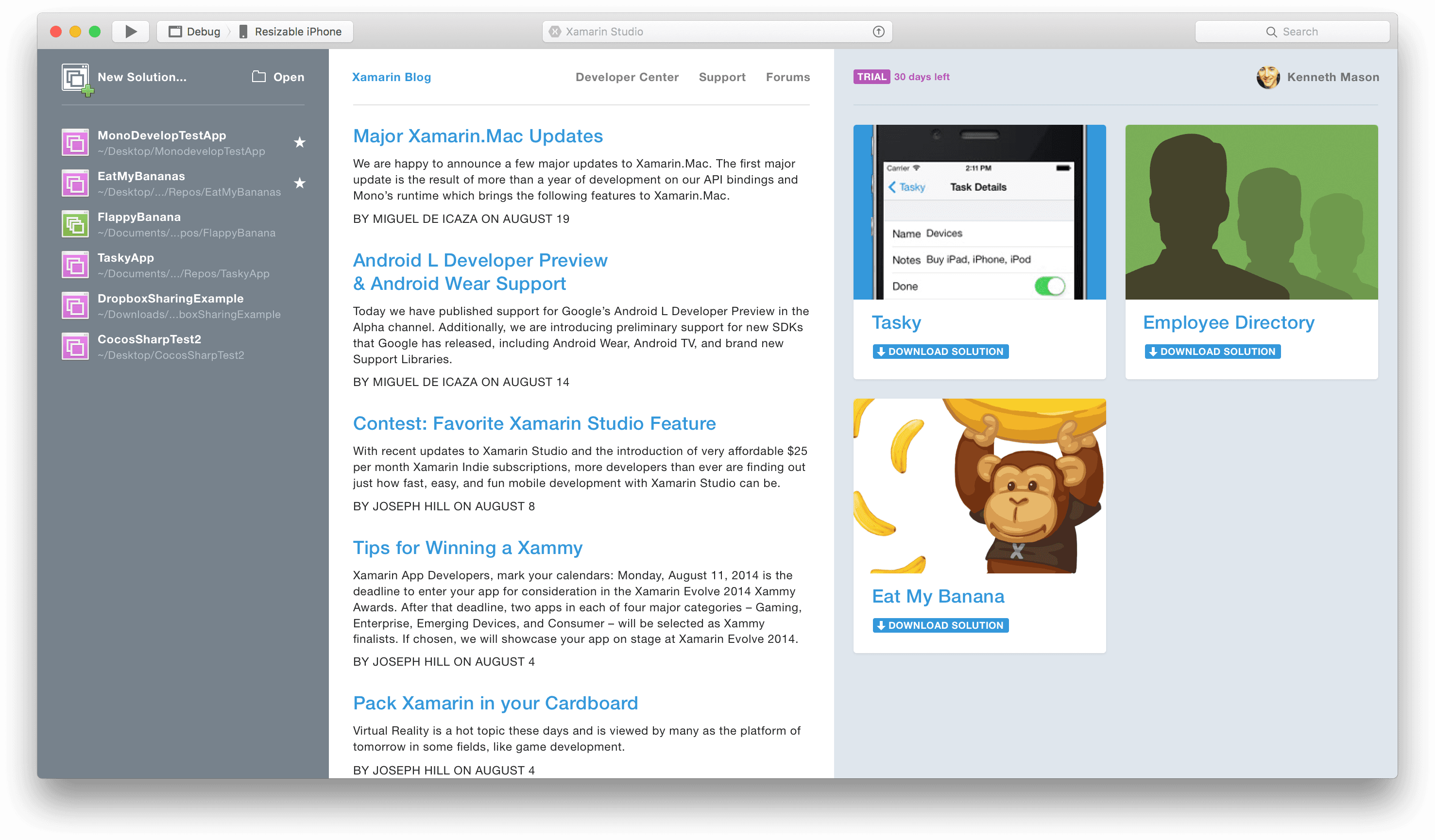
Here is an improved design featuring old icons but with the new chrome, which was also created for the dark UI theme.

Here is an improved design featuring old icons but with the new chrome, which was also created for the dark UI theme.

Here is an improved design featuring old icons but with the new chrome, which was also created for the dark UI theme.

Here is an improved design featuring old icons but with the new chrome, which was also created for the dark UI theme.

Here is an improved design featuring old icons but with the new chrome, which was also created for the dark UI theme.

Here is an improved design featuring old icons but with the new chrome, which was also created for the dark UI theme.

The visual aesthetics of macOS transitioned from shaded icons and UI to a flat design. Xamarin Studio also underwent changes during this period and introduced a large set of icons that I created for it, gradually replacing the old shaded icons.

The visual aesthetics of macOS transitioned from shaded icons and UI to a flat design. Xamarin Studio also underwent changes during this period and introduced a large set of icons that I created for it, gradually replacing the old shaded icons.

The visual aesthetics of macOS transitioned from shaded icons and UI to a flat design. Xamarin Studio also underwent changes during this period and introduced a large set of icons that I created for it, gradually replacing the old shaded icons.

The visual aesthetics of macOS transitioned from shaded icons and UI to a flat design. Xamarin Studio also underwent changes during this period and introduced a large set of icons that I created for it, gradually replacing the old shaded icons.

The visual aesthetics of macOS transitioned from shaded icons and UI to a flat design. Xamarin Studio also underwent changes during this period and introduced a large set of icons that I created for it, gradually replacing the old shaded icons.

The visual aesthetics of macOS transitioned from shaded icons and UI to a flat design. Xamarin Studio also underwent changes during this period and introduced a large set of icons that I created for it, gradually replacing the old shaded icons.

Transition to Visual Studio for Mac

The transformation of Xamarin Studio into Visual Studio for Mac honored a new design chapter, including introducing a versatile dark UI theme. This evolution facilitated developers’ transition to more recent frameworks, emphasizing design continuity and ease of project migration.

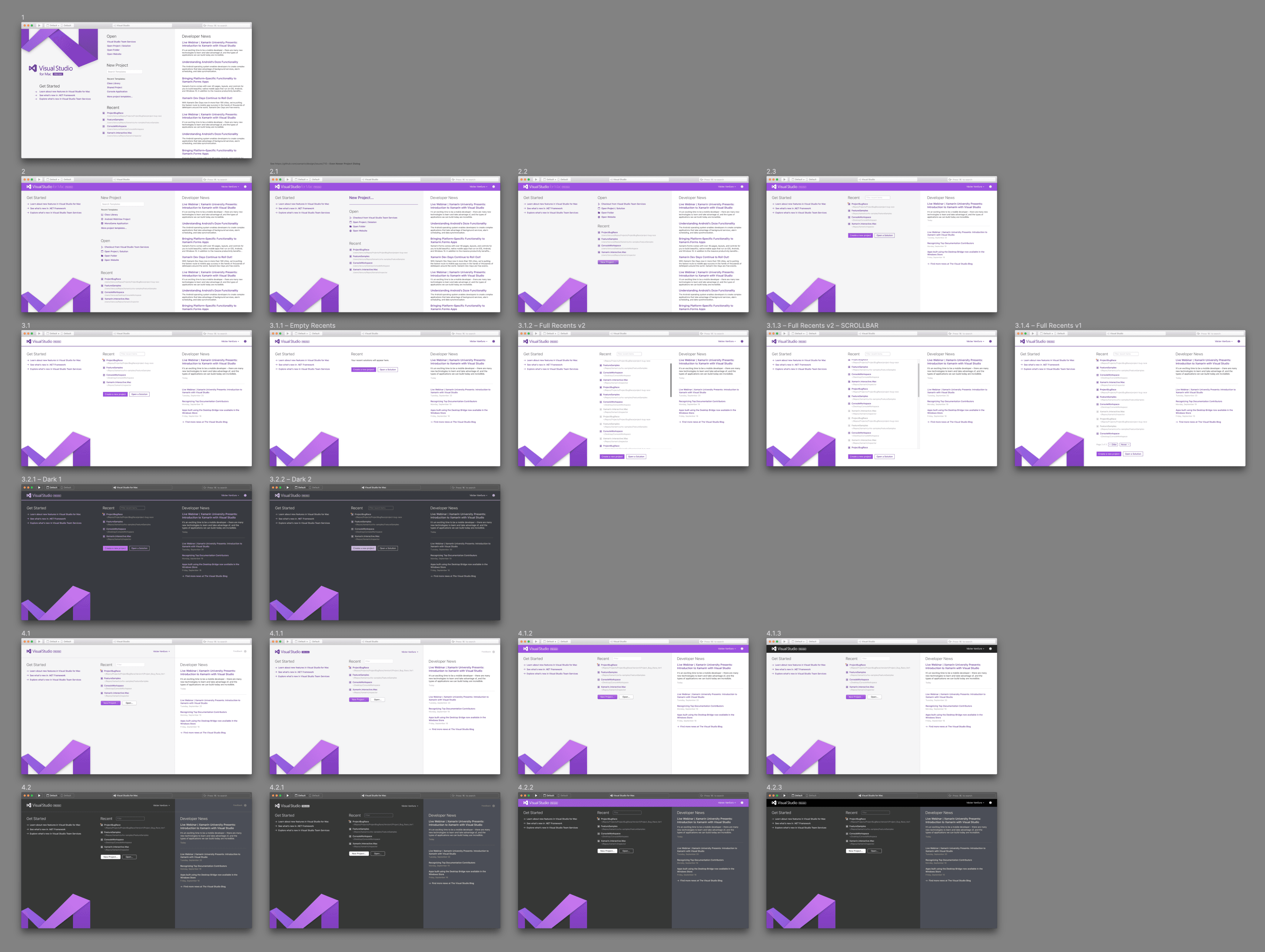
Collage of multiple UI design previews for the Welcome Screen in Visual Studio for Mac, showcasing different pages and features in both light and dark mode themes with prominent purple accents and the Visual Studio logo.

Collage of multiple UI design previews for the Welcome Screen in Visual Studio for Mac, showcasing different pages and features in both light and dark mode themes with prominent purple accents and the Visual Studio logo.

Collage of multiple UI design previews for the Welcome Screen in Visual Studio for Mac, showcasing different pages and features in both light and dark mode themes with prominent purple accents and the Visual Studio logo.

Collage of multiple UI design previews for the Welcome Screen in Visual Studio for Mac, showcasing different pages and features in both light and dark mode themes with prominent purple accents and the Visual Studio logo.

Collage of multiple UI design previews for the Welcome Screen in Visual Studio for Mac, showcasing different pages and features in both light and dark mode themes with prominent purple accents and the Visual Studio logo.

Collage of multiple UI design previews for the Welcome Screen in Visual Studio for Mac, showcasing different pages and features in both light and dark mode themes with prominent purple accents and the Visual Studio logo.

Redlines and wireframes: behind the scenes

Wireframes and redlining are cornerstones in the UI/UX design process, serving as critical communication tools between designers, developers, and stakeholders.

Wireframes provide a skeletal page layout and functionality structure, often lacking in color, graphics, or typographic styles. They are important because they lay the foundation for the design process, allowing designers to map out the user interface and experience without being bogged down by aesthetic details. Wireframes help prioritize content, functionality, and user flow early in the development process, making it easier to iterate and refine the design based on feedback. They are instrumental in ensuring the end product is user-centric, facilitating a clear understanding of how users interact with the application.

Wireframes represent the structural blueprint of the Welcome Screen, outlining the layout and functionality without the detailed visual elements. These tools ensure design consistency and precision in the final product.

Wireframes represent the structural blueprint of the Welcome Screen, outlining the layout and functionality without the detailed visual elements. These tools ensure design consistency and precision in the final product.

Wireframes represent the structural blueprint of the Welcome Screen, outlining the layout and functionality without the detailed visual elements. These tools ensure design consistency and precision in the final product.

Wireframes represent the structural blueprint of the Welcome Screen, outlining the layout and functionality without the detailed visual elements. These tools ensure design consistency and precision in the final product.

Wireframes represent the structural blueprint of the Welcome Screen, outlining the layout and functionality without the detailed visual elements. These tools ensure design consistency and precision in the final product.

Wireframes represent the structural blueprint of the Welcome Screen, outlining the layout and functionality without the detailed visual elements. These tools ensure design consistency and precision in the final product.

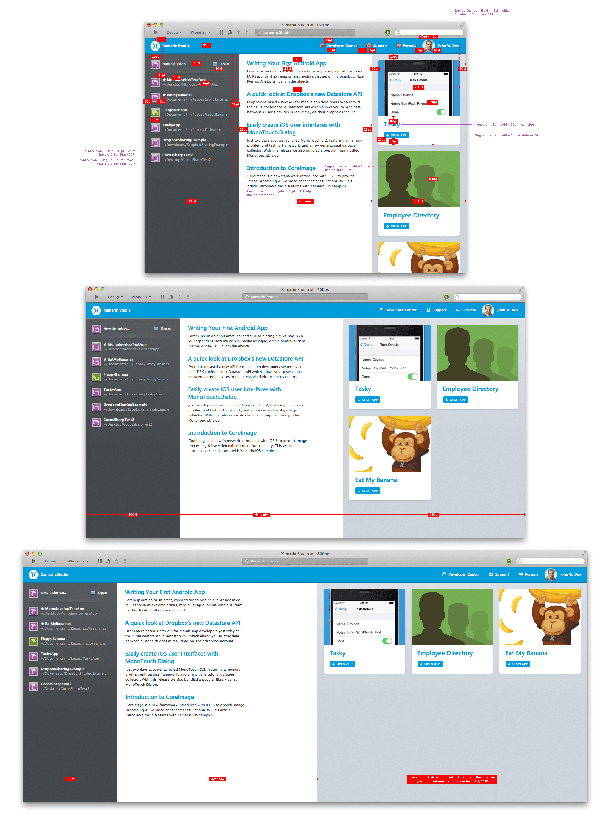
Redlining is the practice of creating detailed documentation that outlines the specific visual details of a design. It includes exact measurements, color codes, font sizes, and spacing, ensuring the developers can precisely replicate the intended design. Redlining is essential because it acts as a blueprint that guides the development process, reducing ambiguity and minimizing the risk of discrepancies between the original design and the final product. It is particularly crucial in complex projects with numerous elements and interactions, where consistency in the user interface is key to a cohesive user experience.

Redlining is the practice of creating detailed documentation that outlines the specific visual details of a design. It includes exact measurements, color codes, font sizes, and spacing, ensuring the developers can precisely replicate the intended design. Redlining is essential because it acts as a blueprint that guides the development process, reducing ambiguity and minimizing the risk of discrepancies between the original design and the final product. It is particularly crucial in complex projects with numerous elements and interactions, where consistency in the user interface is key to a cohesive user experience.

Redlining is the practice of creating detailed documentation that outlines the specific visual details of a design. It includes exact measurements, color codes, font sizes, and spacing, ensuring the developers can precisely replicate the intended design. Redlining is essential because it acts as a blueprint that guides the development process, reducing ambiguity and minimizing the risk of discrepancies between the original design and the final product. It is particularly crucial in complex projects with numerous elements and interactions, where consistency in the user interface is key to a cohesive user experience.

Redlines are detailed guides providing specifications for the implementation of designs, such as margins, font sizes, and color codes, as demonstrated here.

Redlines are detailed guides providing specifications for the implementation of designs, such as margins, font sizes, and color codes, as demonstrated here.

Redlines are detailed guides providing specifications for the implementation of designs, such as margins, font sizes, and color codes, as demonstrated here.

Redlines are detailed guides providing specifications for the implementation of designs, such as margins, font sizes, and color codes, as demonstrated here.

Redlines are detailed guides providing specifications for the implementation of designs, such as margins, font sizes, and color codes, as demonstrated here.

Redlines are detailed guides providing specifications for the implementation of designs, such as margins, font sizes, and color codes, as demonstrated here.

The implementation journey

I reimagined the Welcome Screen and brought it to life through HTML/CSS/TypeScript coding. This approach, while not native, allowed for rapid development and iteration.

The implementation journey

I reimagined the Welcome Screen and brought it to life through HTML/CSS/TypeScript coding. This approach, while not native, allowed for rapid development and iteration.

The implementation journey

I reimagined the Welcome Screen and brought it to life through HTML/CSS/TypeScript coding. This approach, while not native, allowed for rapid development and iteration.

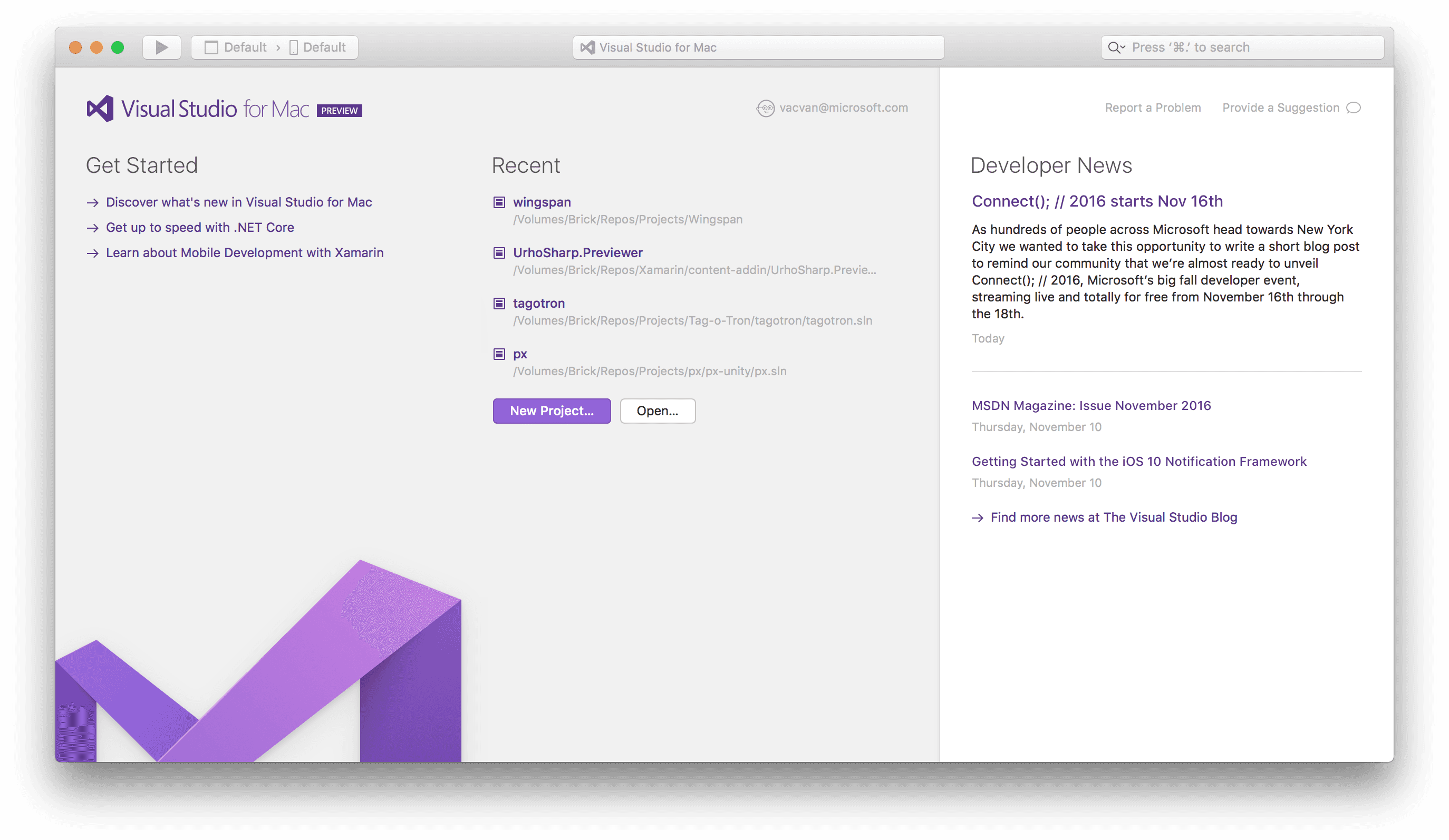
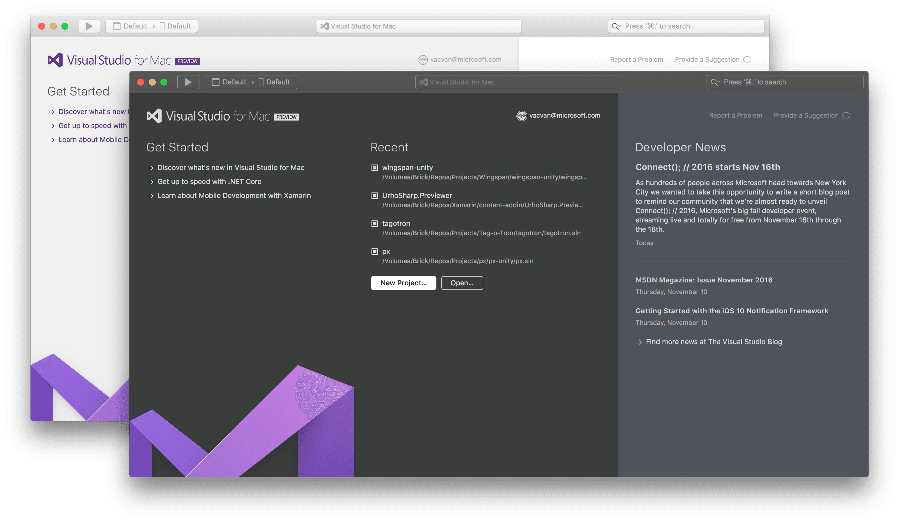
Final design of the Welcome Screen in Visual Studio for Mac in the light UI theme

Final design of the Welcome Screen in Visual Studio for Mac in the light UI theme

Final design of the Welcome Screen in Visual Studio for Mac in the light UI theme

Final design of the Welcome Screen in Visual Studio for Mac in the light UI theme

Final design of the Welcome Screen in Visual Studio for Mac in the light UI theme

Final design of the Welcome Screen in Visual Studio for Mac in the light UI theme

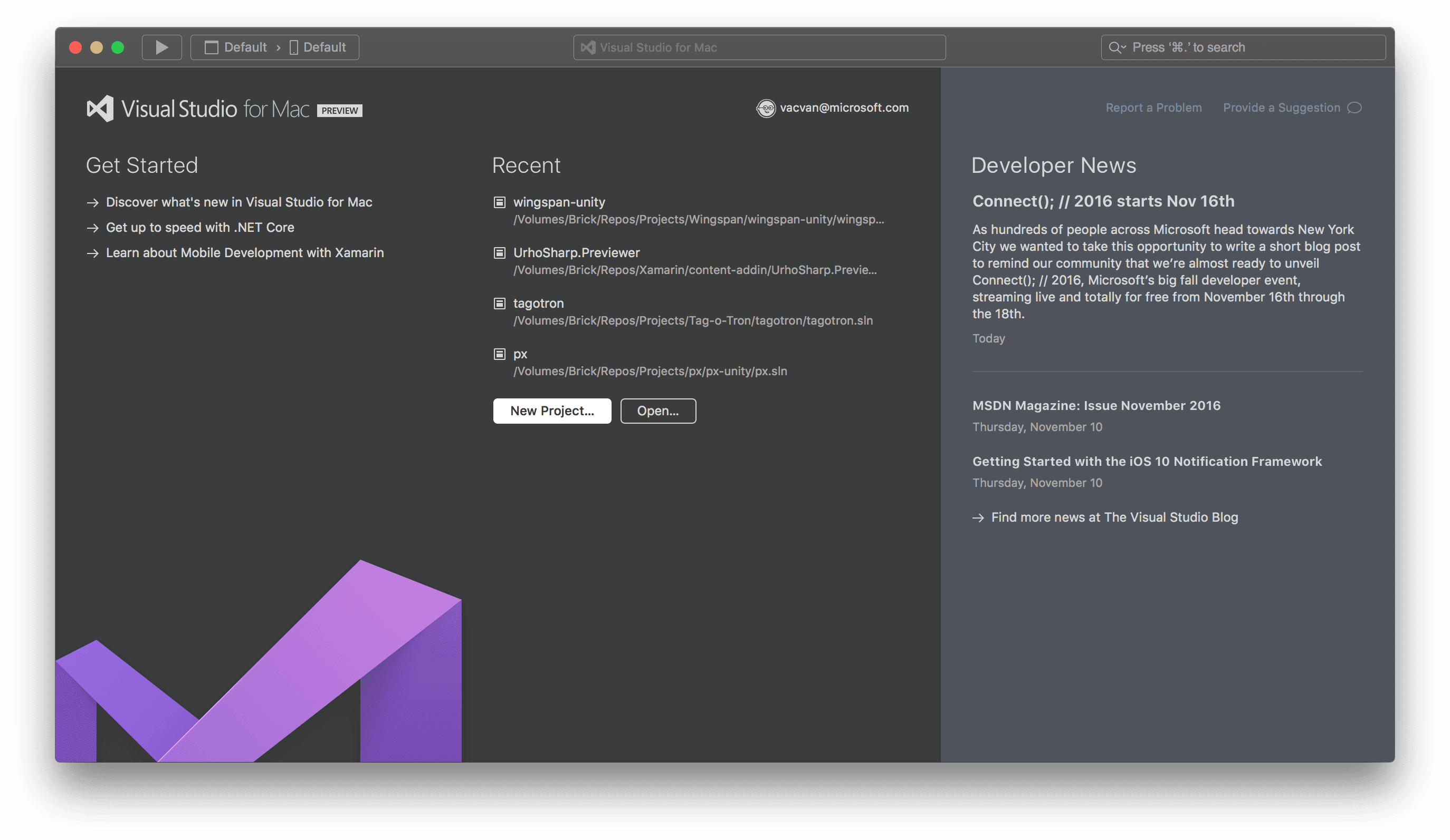
Final design of the Welcome Screen in Visual Studio for Mac in the dark UI theme

Final design of the Welcome Screen in Visual Studio for Mac in the dark UI theme

Final design of the Welcome Screen in Visual Studio for Mac in the dark UI theme

Final design of the Welcome Screen in Visual Studio for Mac in the dark UI theme

Final design of the Welcome Screen in Visual Studio for Mac in the dark UI theme

Final design of the Welcome Screen in Visual Studio for Mac in the dark UI theme

However, it also came with challenges, such as the HTML core’s substantial memory usage, which was a trade-off for several years of effective performance.

However, it also came with challenges, such as the HTML core’s substantial memory usage, which was a trade-off for several years of effective performance.

However, it also came with challenges, such as the HTML core’s substantial memory usage, which was a trade-off for several years of effective performance.

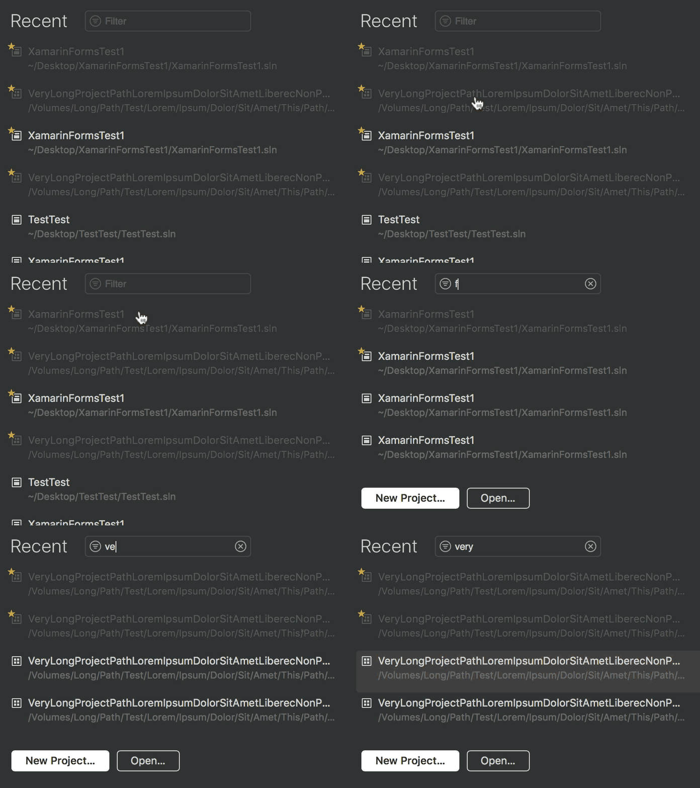
The animation reveals the dynamic search flow, a testament to the TypeScript implementation’s capabilities, demonstrating responsiveness and interactivity that significantly enhances the user experience.

The animation reveals the dynamic search flow, a testament to the TypeScript implementation’s capabilities, demonstrating responsiveness and interactivity that significantly enhances the user experience.

The animation reveals the dynamic search flow, a testament to the TypeScript implementation’s capabilities, demonstrating responsiveness and interactivity that significantly enhances the user experience.

The animation reveals the dynamic search flow, a testament to the TypeScript implementation’s capabilities, demonstrating responsiveness and interactivity that significantly enhances the user experience.

The animation reveals the dynamic search flow, a testament to the TypeScript implementation’s capabilities, demonstrating responsiveness and interactivity that significantly enhances the user experience.

The animation reveals the dynamic search flow, a testament to the TypeScript implementation’s capabilities, demonstrating responsiveness and interactivity that significantly enhances the user experience.

The journey from Xamarin Studio to Visual Studio for Mac was a continuous improvement and attention to detail. The Welcome Screen evolved into a more engagingand intuitive interface through each stage. This commitment enhanced the developer’s first point of interaction; it set a precedent for the fusion offunctionality with aesthetic appeal across the entire IDE.
The journey from Xamarin Studio to Visual Studio for Mac was a continuous improvement and attention to detail. The Welcome Screen evolved into a more engagingand intuitive interface through each stage. This commitment enhanced the developer’s first point of interaction; it set a precedent for the fusion offunctionality with aesthetic appeal across the entire IDE.

The journey from Xamarin Studio to Visual Studio for Mac was a continuous improvement and attention to detail. The Welcome Screen evolved into a more engagingand intuitive interface through each stage. This commitment enhanced the developer’s first point of interaction; it set a precedent for the fusion offunctionality with aesthetic appeal across the entire IDE.

Collaborators and consultants

Collaborators and consultants

Collaborators and consultants

David Siegel

Head of Design

David Siegel

Head of Design

David Siegel

Head of Design

Hylke Bons

Senior Designer

Hylke Bons

Senior Designer

Hylke Bons

Senior Designer

Vsevolod Kukol

Principal Software Engineer Manager

Vsevolod Kukol

Principal Software Engineer Manager

Vsevolod Kukol

Principal Software Engineer Manager

Lluis Sanchez Gual

Principal Software Engineer Manager

Lluis Sanchez Gual

Principal Software Engineer Manager

Lluis Sanchez Gual

Principal Software Engineer Manager

Thanks for reading

Thanks for reading

Thanks for reading