The new appearance is easy to spot, and the new color palette is highly noticeable. Let me explain why these changes were necessary and what exactly was changed.
Currently, more than 1 billion people experience some form of disability. People must live with various types of obstacles – mobility, cognitive, neural, speech, and hearing. But let’s talk about our visual accessibility enhancements and what you can experience in the most recent versions of Visual Studio for Mac.
The World Health Organization calculated that approximately 200 million people currently live with some form of vision impairment. Our goal is for Visual Studio for Mac to be accessible to everyone. We must make sure that we deliver the best user interface experience to every user, whether they are visually impaired or not. Users may suffer from many visual accessibility issues: low vision, color, or total blindness, cataracts. Even such a common thing as sun glare could be a problem when using an application UI. One way to empower visually impaired users to interact with applications more effectively is through color accessibility.

One of the fundamental ways to deliver an accessible UI is to boost the contrast ratio threshold of all interactive content – primarily text and icons. On a Mac, the background-to-text contrast ratio must be at least 3:1 and at least 4.5:1 in High Contrast mode. We’ll talk more about later in the blog post.
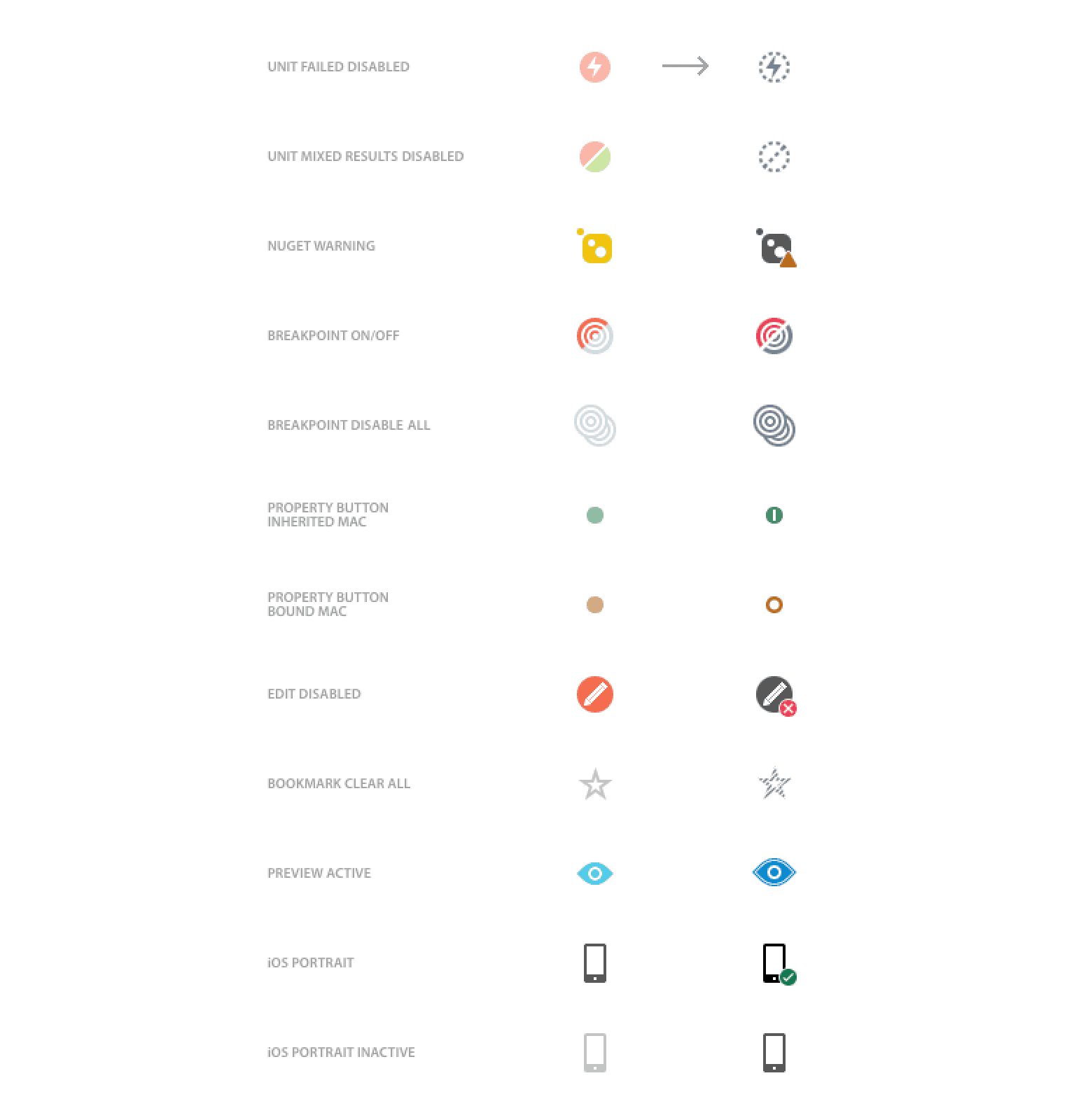
Another essential requirement here is that we shouldn’t display information differences with just a color shift, such as a status change between an inactive and active icon. Similarly, no information should rely only on color to show its severity. That means elements such as error or warning messages should not use only the background color to communicate their status. We need something more: for example, a highly visible error or warning symbol. In older versions of Visual Studio for Mac, there were numerous instances where we showed a status difference using just a color. We use a more distinctive rendering of activated, disabled, and stopped icons, not relying solely on color. We’ve eliminated those sorts of situations in the interest of greater visual clarity.
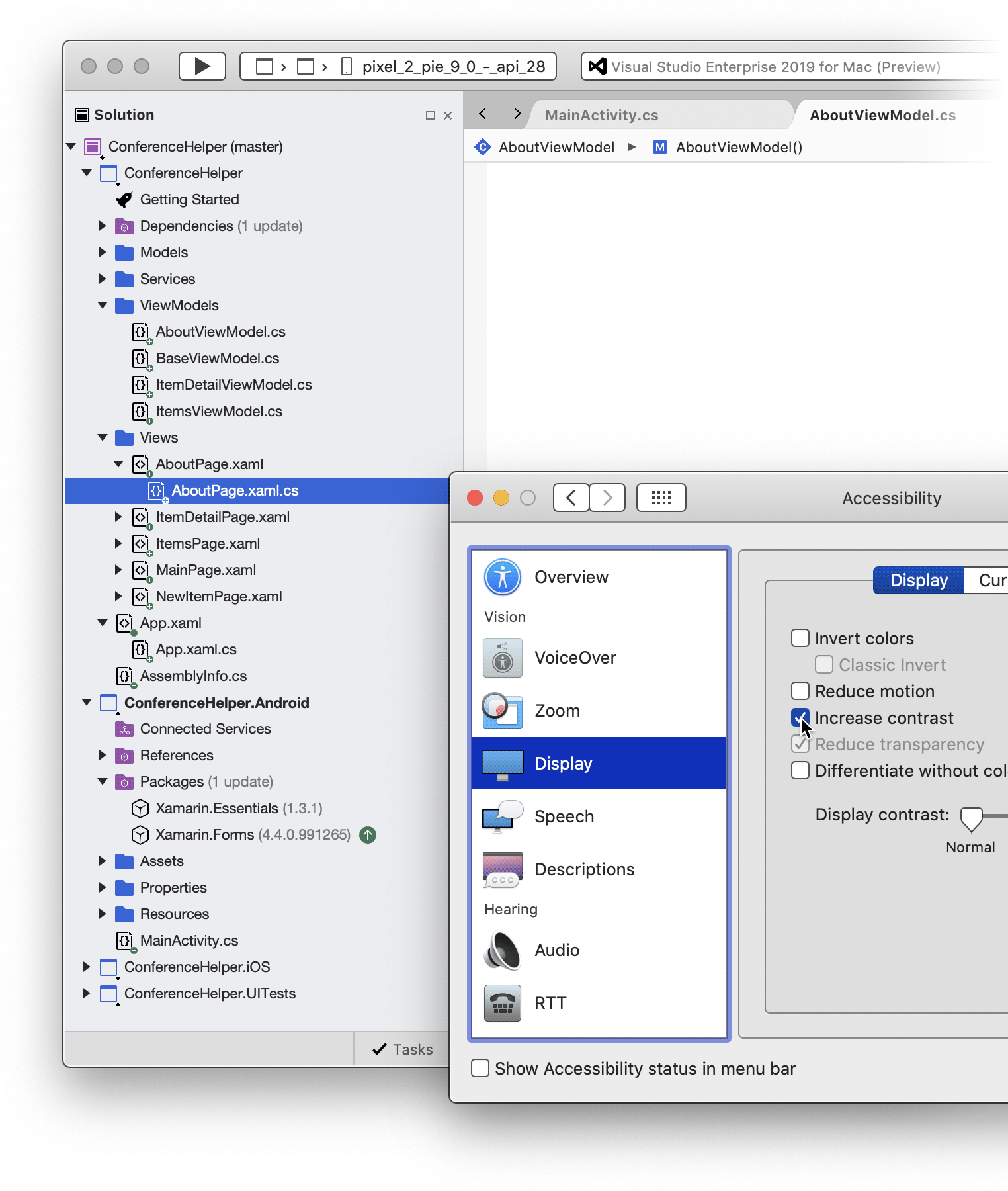
High Contrast Mode
On a Mac, you can toggle the setting for High Contrast Mode by visiting Accessibility Preferences in System Preferences and clicking the Increase Contrast checkbox:
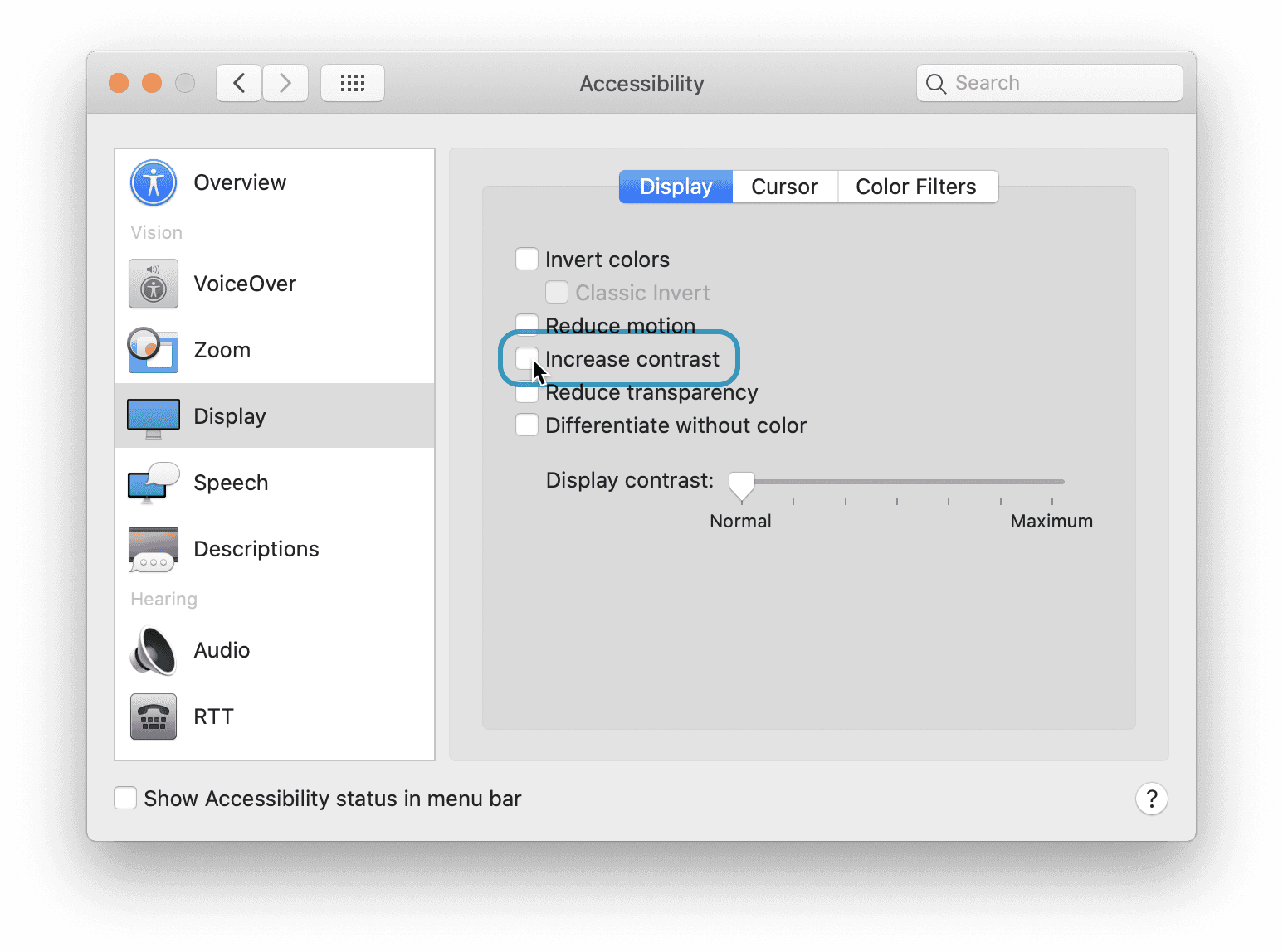

High Contrast Mode increases the color contrast of the whole system’s UI. Controls begin to use strokes and more easily visible shapes and labels. The colors are adjusted to appear more vibrant, and the difference in brightness between the foreground and the background is much more noticeable.
Unfortunately, not all applications on our desktops support High Contrast Mode. Native macOS controls provide High Contrast rendering for free, but it’s up to developers to update their custom controls. Some parts of the Visual Studio for Mac shell are heavily customized, so we still have some way to go.
Of course, using new colors and icons isn’t the only way to improve accessibility. We also wanted to ensure we enhance screen readers’ experience and make sure keyboard shortcuts are available everywhere. We have many more improvements we’ll talk about, and others we’ll introduce soon. For now, we’ll focus on the new color palette and improved icon set, new features that are currently visible to every Visual Studio for Mac user.
New color palette
Our old Visual Studio for Mac color palette, which was created many years ago, used contrast ratios that were too low, especially in the light IDE theme. Hence, it was finally time for us to update on this front. You can see a comparison between our old and new palettes below, with contrast ratios between the background and foreground.
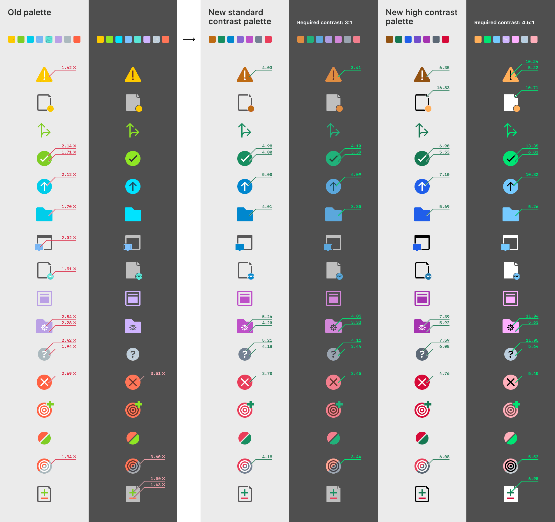

The old palette had two variants: one for the light and one for the dark IDE theme. As you can see above, the old palette suffered from many problems, especially the color contrast ratio of light-theme warning icons, which was less than ideal. Yellow on white or light gray is extremely difficult for anyone to see.
The new palette fixes all these issues and is also simpler, with better semantic meaning of the color groups. Plus, it’s ready for High Contrast Mode.
Improved icons
We always had tons of icons in Visual Studio for Mac. By the time we released the changes detailed in this post, there were 1142 icons. Most of the icons came in four flavors: two for light and dark themes and two for selected states (usually white-only glyph, displayed on the top of the system-wide accent color). We had all these a second time because we needed icons available for standard and high DPI (@2x) resolutions.
Now, we have twice as many icons, and it was a tremendous job. Every single one had to be checked for accessibility issues as described above, converted to the new palette, duplicated, and repainted using the new High Contrast palette. That means we’re not just introducing new High Contrast icons; we’re also improving all our already existing ones. At this very moment, Visual Studio for Mac uses 13704 icon files.
Some icons needed to be redrawn or adjusted, as they relied solely on color to show differences, such as the difference between normal and active states:

New warning and error colors
We also took this opportunity to change the colors of warning- and error-related messages Visual Studio for Mac shows. You’ll notice this most with light theme warning text, which was previously brighter than ideal and potentially challenging to read.
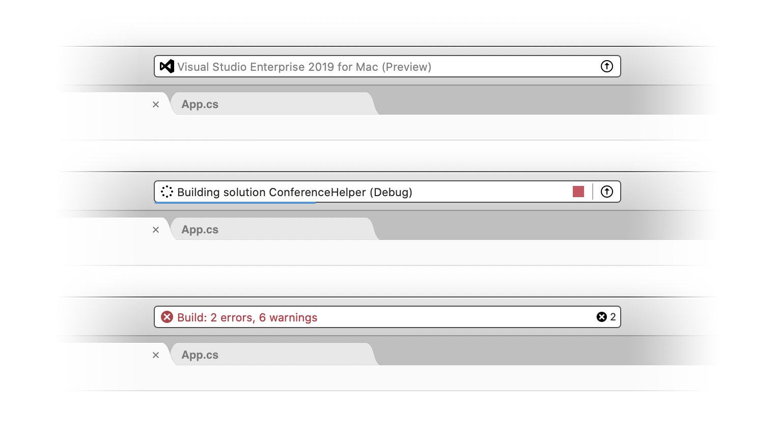
We now have new colors for error popovers, with a better appearance in general and when in High Contrast Mode:
Helpful to everybody
The changes described above aim to make the UI of Visual Studio for Mac easier for all developers to use. We have highly readable icons for visually-impaired users, but our already established standard icon set sports new, more prominent contrast in colors and helping the users with no accessibility demands at all. In any case, we still have much work ahead of us, but we’re getting better every day.